Sake
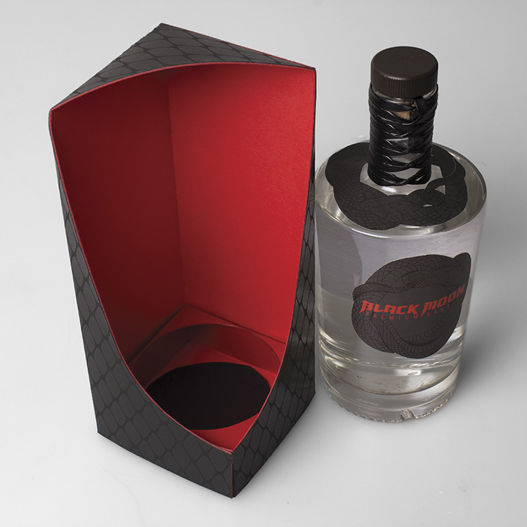
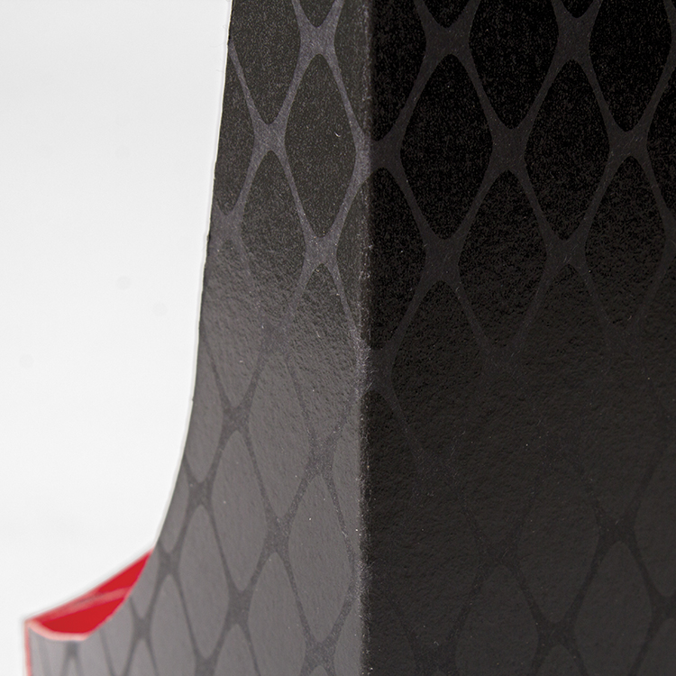
Logo, label and packaging
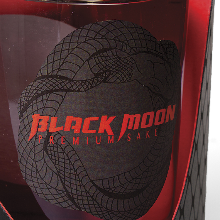
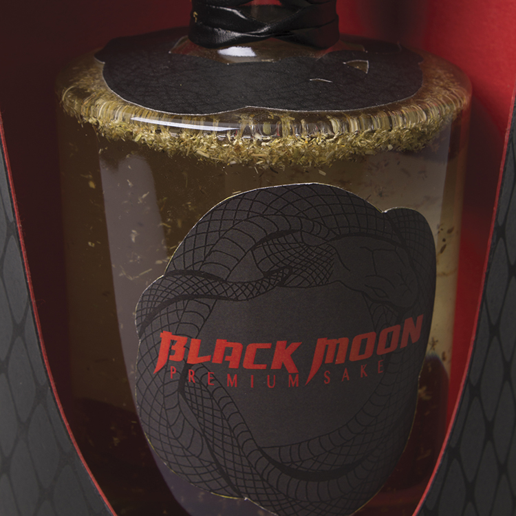
Tsuba; The hand guard mounted on a katana; a Japanese sword.
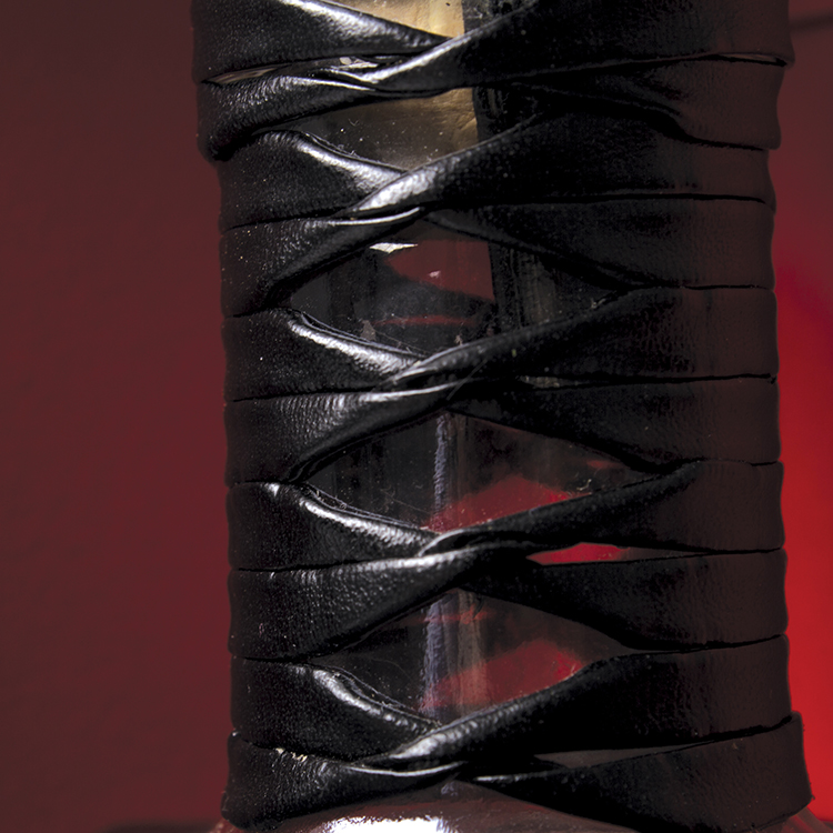
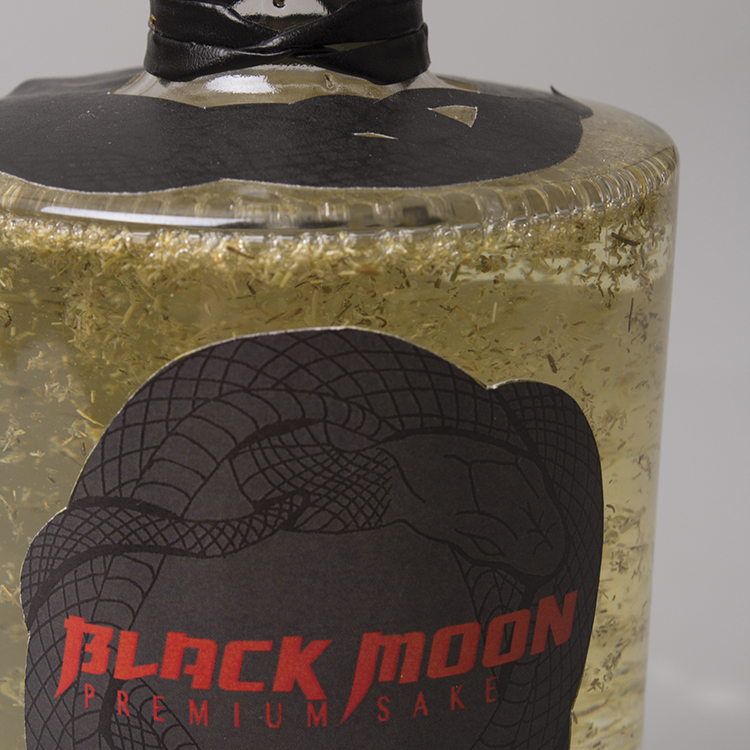
The identitiy of black moon premium sake is masculine, strong and inspired by a tsuba. The coiled snake featured on both the bottle and its packaging represents good luck and good health in Japanese culture. The snake support graphic was created through illustration and then hand-carved into a linoleum block before being printed in ink. The digitised outcome was paired with a hand rendered and completely custom logotype.