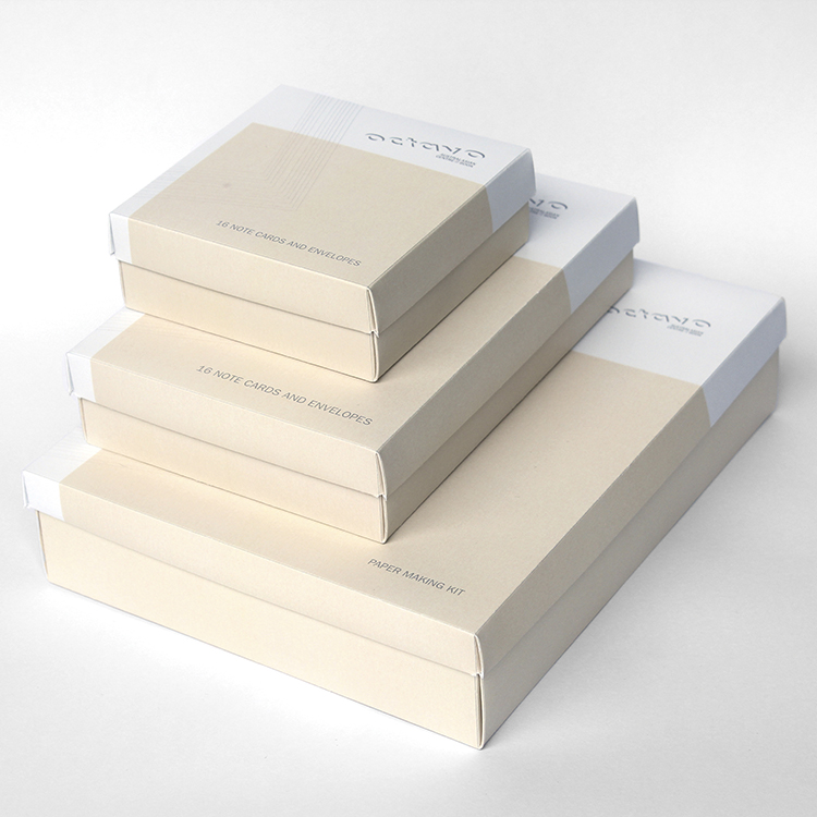
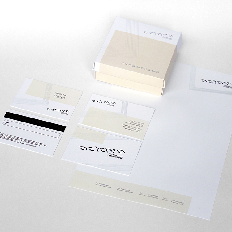
Octavo
Visual identity, packaging and brand experience
Bibliophile; An individual who loves books.
The visual identity for Octavo, the Australasian Centre for the Book, is inspired by the concept of stepping through the layers of time. As the home of bookmaking disciplines, Octavo aspires to pass on knowledge to be reinvented and reinterpreted by future generations. The logotype is designed to simulate being cut from stacks of paper. The support graphic emulates layers of paper, which represents the layers of knowledge, layers of history and layers of time.